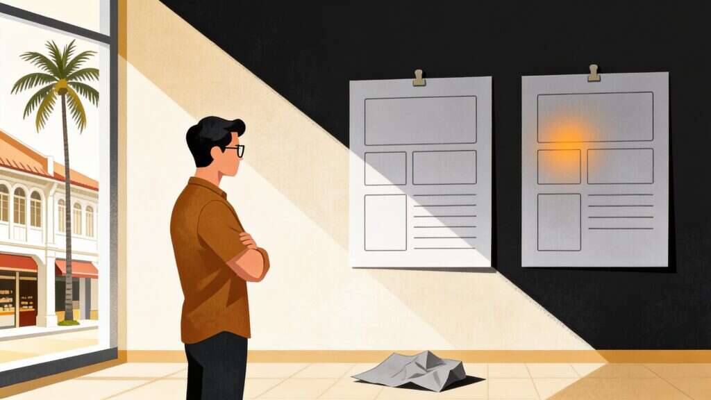
The tool did not make it look cheap. Skipping the judgement did. Everything on this site was built with AI in the loop, including the article you are reading, and the reason it does not look like the flood of AI-made pages published this year is not a better model. It is three or four gates that most people skip because skipping them is faster.
I am going to name the whole stack and show you the parts that did not make it, because an article about quality that only shows the wins is exactly the kind of thing I am complaining about.
What slop actually costs
These next figures are not mine, so treat them as survey data rather than measurement. Roughly 62 per cent of consumers report being less likely to trust content once they know AI made it, and the reporting on the B2B slop backlash puts 54 per cent of Gen Z as willing to lose trust in a brand that uses AI for most of its marketing. None of that is an argument for hiding your use of AI. Undisclosed use, once discovered, damages every prior interaction a customer had with you, which is a worse trade than being upfront.
The commercial cost is more boring than the ethical debate. Slop looks like everyone else. When your homepage could be swapped with a competitor’s and nobody would notice, you have not been let down by a model. You have skipped the part of the job where somebody decides what this particular business should look like.
Wireframe first, without exception
This is the rule that removes most of the problem, and it costs nothing.
Nothing gets built until the structure is agreed in low fidelity. Boxes and labels, no colour, no typography, no imagery. If the page does not make sense as grey rectangles, it will not be rescued by a gradient.
I learned to insist on this the hard way on my own rebuild. The first pass at the Field Notes templates was assembled from stock components and it looked competent and generic, so I rejected it and started again from a wireframe. That cost a day. Shipping it would have cost more, because the page it produced said nothing about me.
The stack, named
Claude Code does the building. It edits this WordPress site directly over MCP connections rather than through admin screens, which means changes arrive as code I can read and reverse.
On top of that sit a few skills, which are just packaged instruction sets that load when the work calls for them. /ui-ux-pro-max, by nextlevelbuilder, carries interface and layout judgement, so the structural decisions get argued before they get built. /taste, by leonxlnx, exists to stop the output looking templated, which is the specific failure I am describing here. /humanizer, by blader, runs over every piece of copy hunting the tells: inflated significance, promotional adjectives, rule-of-three padding, the em dash habit, sentences that all breathe at the same rate.
None of those three are mine. They are open source under MIT, and the links are there so you can read exactly what each one instructs rather than take my word for how I work.
The imagery comes from Project Reverie, the generation studio we build and run at OpenMinds. It produced every illustration in this series, including the one I rejected further down.
None of that removes the need to have an opinion. The skills raise the floor. They do not choose what the page should feel like, and nothing in the stack will tell you that your homepage is indistinguishable from your competitor’s.
How I prompt for imagery, and what a lazy prompt looks like
Most bad AI imagery comes from prompts that describe a subject and nothing else. Here is the lazy version of the request behind the illustration on my zero-click article:
That will give you a stock-photo cliché in a palette that belongs to nobody. Here is the prompt I actually used, unedited:
16:9 composition. A single male figure with dark hair and glasses, seen in
profile from behind, wearing a warm rust-brown shirt, standing with hands in
pockets looking up at a large deep-charcoal wall. On that wall, two thin line
graphs drawn in fine pale strokes: one broad light-grey line descending
steeply from the upper left down toward the centre, and one slimmer amber line
running almost perfectly flat and level all the way across. A single small
glowing amber dot sits on the flat amber line. Bold diagonal blocks of warm
cream and sand-coloured light fall across the lower left of the frame from an
off-frame window, with a hint of a tropical colonial shophouse facade visible
through the window at far left. Palette strictly limited to deep charcoal
near-black, warm cream, sand tan, muted grey, and one amber accent. Generous
negative space, calm, restrained, premium editorial feel, no clutter.
Absolutely no text, no letters, no numbers, no axis labels, no captions, no
watermarks, no logos anywhere in the image.
Four things are doing the work there. The palette is locked to the colours this site already uses, so the picture belongs here rather than anywhere. The composition is specified, because left unspecified you get the centred, symmetrical arrangement the model finds safest. The setting is local, since a shophouse and a palm tree place the work in Kuala Lumpur instead of a generic office. And the exclusions are explicit, because generated lettering arrives malformed and I have had to regenerate images in this series for exactly that reason.
One more thing I do that is less obvious: I pass an existing image from the series as a style reference. That is why these illustrations look like siblings rather than seven separate experiments.
Video works the same way in that studio, through the Seedance models rather than Seedream, with one addition to the discipline: you have to say what moves and what holds still. Leave that out and everything drifts at once, which is the moving-picture version of the same problem. Every illustration in this article is a still, so take that as a note on method rather than a result I am putting in front of you.
The one I threw away
Two images came out of that prompt run. I shipped one and binned the other, and the binned one is more instructive.


Look at the right-hand one for a moment. It is arguably the prettier image. The palette is right, the grain is right, the shophouse is charming. It also fails at its job, because the whole point was two lines you could compare, and the grey one wanders out of the dark panel and stops relating to the amber one. The figure is sliced off at the bottom in a way that reads as a mistake rather than a crop.
A model cannot catch that, because it does not know what the image was for. I knew, because I had written the article. That is the gate, and it takes about fifteen seconds.
Why I treat this as commercial rather than decorative
The clearest evidence I have does not come from design work at all. The Musang King Channel grew past 300,000 subscribers on a bet against the norms of its market, which rewarded pranks and volume. The team committed to real stories, filmed properly, about ordinary life. Whenever the channel has drifted back toward prank-style content, the numbers have never matched the true-to-brand work.
That pattern is the whole argument, moved into a different medium. Audiences reward the thing that could only have come from you. Slop is by definition the thing that could have come from anyone.
The disclosure
This site was designed and built with AI assistance, and its articles are drafted with it, including this one. Every line is reviewed before it ships, and I want to understand why something was suggested before I let it through. That is not a caveat I am burying at the bottom. It is the point.
I do not call myself an AI expert. Malaysia has plenty of those already, most of them repackaging what somebody else published. What I will claim is narrower and more useful: I run these tools on real client work daily, I keep the receipts, and when the output is not good enough I throw it away.
If your site was built quickly and now looks like everyone else’s, that is a fixable problem and it usually starts with a wireframe. I have also written about what these tools genuinely took off my week and what my own search data did while all of this was going on. If you would rather talk it through, start a conversation.