On 12 July I rejected the website carrying my own name, the same way I would reject weak work from a vendor. Two days later the replacement was live. The speed is not the lesson. The order of the work is, and since I have already written about why judgement matters more than tools, this piece is the other half: the actual rebuild, step by step, from the version that failed to the launch checklist, with the real artefacts along the way.
The version that failed, with receipts
The first build took shape on 11 July and it was competent. Hero, service cards, a three-step process strip, stat counters, a free website audit as the big offer. It looked like a freelance marketer’s site because it was assembled from the moves every freelance marketer’s site makes.
| Element | The rejected version | What shipped |
|---|---|---|
| Headline | No buzzwords. Just fifteen years of making digital marketing work. | I AM RANDY TOO. |
| One-liner | Performance marketer, WordPress builder, and co-founder at OpenMinds. | I connect strategy, technology and people so digital actually works. |
| Call to action | Audit my website — free | Start a conversation |
Read that old headline again. It promises no buzzwords on a page built entirely from borrowed patterns, and the button carries an em dash, the punctuation tell I now strip from everything. The deeper problem was strategic. The page was a lead-generation funnel pointed at strangers, optimised to capture an email address before it had earned anyone’s attention. Swap the name out and it could have belonged to any consultant in Kuala Lumpur.
Positioning came before pixels
The fix did not start in a design tool. It started with an interview, the same one I would run on a client: who is this actually for, and what does a visitor need to feel in the first ten seconds.
The answers changed everything downstream. I am not a performance marketer with a form. The honest description is a digital landscape consultant, someone who connects strategy, technology and people, and the site’s job is to be a brand statement rather than a funnel. That means it has to work for a CEO, a founder, a peer and a fresh graduate at the same time, which no audit offer can do.
Positioning made the structure obvious. The free-audit page went. The about page went, folded into one long homepage that reads top to bottom like a story. What remained was three real pages and a privacy notice: Home, Field Notes, Contact. One call to action sitewide, start a conversation, because that is the only thing I actually want a visitor to do.
The wireframe is where taste happens
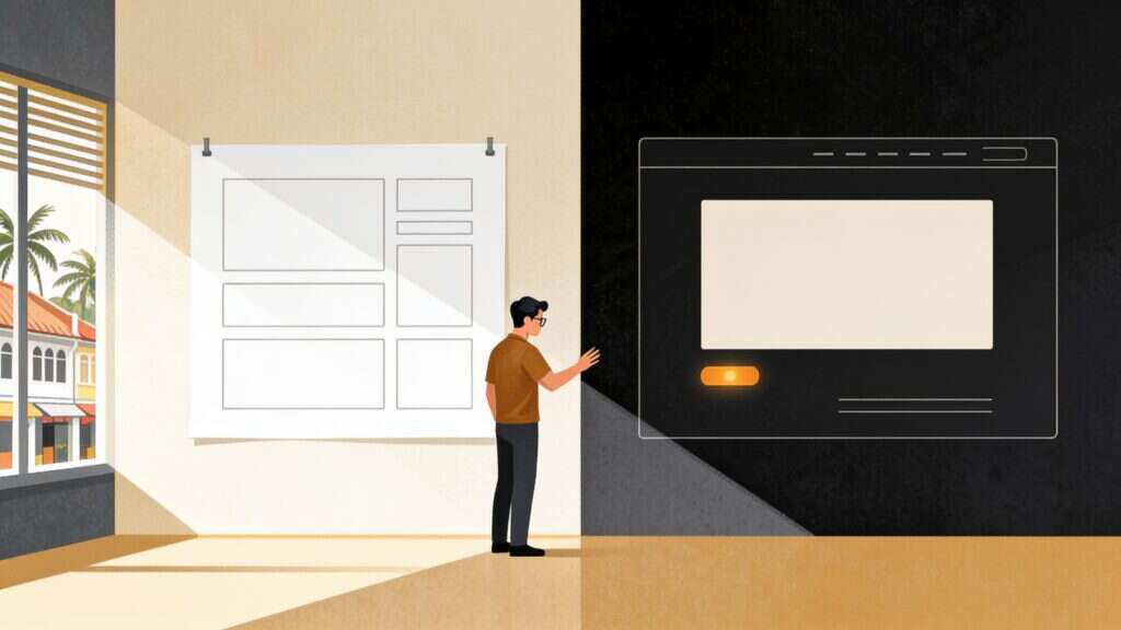
Nothing got styled until the structure was agreed as grey boxes and labels on 13 July. I have made the full argument for wireframe-first in the judgement piece, including the figure, so here I will only add what it unlocked.
Working in boxes forces you to find the one thing a template cannot copy. Mine is a mountain. The fine contour lines that run through the hero, the section dividers and the chapter rings are traced from the real topography of Mount Kinabalu, which I climbed in March 2013. It costs nothing to render, and no one else can honestly use it, because the linework records something I actually did.
Eighteen declarations run the whole design
Before the first section was built, the entire visual system was written down as design tokens, a short list of named values that everything else refers back to. The whole list runs to eighteen declarations: nine colours, three typefaces and six spacing steps, with a single accent among them. It fits on one screen with room to spare, and that smallness is the point.
Every section on the site references those named values, and the page builder’s global settings map onto the same values, so the editor and the code cannot quietly disagree. When a client asks why their site feels inconsistent, the answer is usually that no such list exists, and every new page invents its own greys.
The build ran through gates
Claude Code did the building, editing this WordPress site directly through MCP connections rather than admin screens, in small changes I could read and reverse. The tools are named, credited and linked in the companion piece. What matters here is that nothing went live on its own judgement. Every piece of work passed through a gate built for its failure mode.
Copy went through a copywriting skill that argues with every headline, then a humanizer pass that hunts the tells: inflated adjectives, uniform sentence rhythm, the em dash habit. House rule, zero em dashes in my own prose. You have already seen the one exception in this article, quoted as evidence.
Design decisions went through interface-judgement skills, and one example shows the value. The header. On the homepage the hero already says my name at full size, so a wordmark up top would say it twice; the skill argued for a monogram alone there, with the full wordmark only on inner pages. It is a small call, and exactly the kind a template never makes.
Every page then passed three SEO skills covering schema, page structure and content quality before it counted as done. Two rules held regardless of what any skill said: all content stays readable with JavaScript switched off, and every animation respects the visitor’s reduced-motion setting. Checks were done by reading the page’s computed styles and a 390 pixel emulated viewport, because a screenshot can look right while the code underneath is wrong.
Launch was a checklist, not a moment
| Date | What happened |
|---|---|
| 11 July | First version built. Competent, generic, funnel-shaped. |
| 12 July | Rejected it. Repositioned through a proper interview. |
| 13 July | Wireframe and full copy deck approved. Token system locked. |
| 14 July | Cutover. Front page swapped, old pages archived, four unused plugins deactivated. |
| 15 July | Caching re-enabled, which promptly broke the design. See below. |
| The fortnight after | Search Console reindexing, image renames, a portrait swap, a rebuilt 404 page. |
Three details from cutover day earn their keep. Old pages were archived, never deleted, so every decision stays reversible. Four plugins the new site no longer used were switched off the same hour, because launch is the one moment you are certain what the site depends on. And the swap itself was one setting, not a migration, because the new pages had been built on their final addresses all along.
Then the trap. The caching plugin that speeds this site up also tree-shakes the stylesheets, stripping any CSS selector it believes no page uses. It decided my design tokens were unused and stripped them from the public view. Logged in, the site looked perfect. Logged out, the design was gone. The fix was an allowlist, but the lesson outlives the plugin: after launch, always check the live site logged out, the way a stranger sees it. Your logged-in view is a comfortable lie.
The order is the lesson
Positioning, then structure, then system, then build, with gates through all of it and a checklist at the end. Most rebuilds I have watched go wrong ran that sequence backwards, starting with colours and hoping a message would turn up later.
Anyone who has worked with me knows I map things before I build them, so here is the whole rebuild the way it actually lives in my head.
If your own site could be swapped with a competitor’s without anyone noticing, the fix does not start in a colour picker. It starts with the question I had to answer about myself in July: what do you do that nobody else can claim? Once that sentence exists, the rest of this walkthrough is just work. If you would rather talk it through first, start a conversation.